The Burberry Equestrian Knight – protection, chivalry, reform
TADS has recently discovered an interesting link between Major Roller and the iconic ‘Burberry Equestrian Knight’ logo.
Thomas Burberry was a canny businessman, who was very aware of the need to protect his company and its products from imitators and piracy. The establishment, growth and success of the Burberry name was not achieved without a long process of legal application and struggle.
Over the years many trademarks and logos were designed to promote and protect the company’s products. The original ‘Gabardine’ registered trademark, which successfully held off competitors for nearly forty years, was relinquished in 1917 during World War I.
![]()
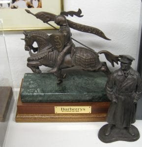
Burberry Equestrian Knight; note the spelling with an ‘s’.
In about 1901 the company ran a public competition to design a new logo. The winning entry was inspired by 13th and 14th century armour at the Wallace Collection in London and for more than a century the ‘Burberry Equestrian Knight’ device was the company’s most familiar logo.
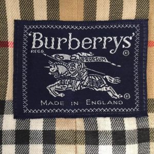
Burberry Equestrian Knight on a check garment.
The logo depicts an equestrian carrying a shield. Various parts of the logo have different meanings: Protection by the armour; Honourable dealing by the chivalry of knighthood; and Reform in methods of excluding wet hostile to rubber mackintosh, indicated by the menace of the couched lance. The word ‘Prorsum’ on the banner is a Latin adverb used in heraldry as a motto and means ‘Forwards’, to suggest progress in manufacture and invention.
Ever careful to safeguard the interests of his business and products, Thomas Burberry registered the logo. Recalling his part in the history of the logo, Frederick A Roller, the company’s solicitor and younger brother of Tadley resident Major George Roller, wrote:
‘I suggested to the London partners whom, at that time, I saw every day, that it would be a good thing to register a general trade mark which could be used in connection with all Burberry goods, and become distinctive of their manufacture or merchandise. They agreed to the suggestion and favoured the registration of the Equestrian Knight which had already appeared on the catalogue…. I pointed out that however suitable this design might be symbolically, it was quite inaccurate in all its details, and I accordingly got authority to instruct Messrs Swain to send an artist, after I had obtained the necessary permission, to the Armoury of the Wallace Collection at Hertford House, Manchester Square, and for him to make an accurate copy of one of the finest existing examples of the actual armour used by Knights and their War-horses in the 13th and 14th centuries. Archaeologists all agreed that the Wallace specimen is far superior to that in the Tower of London, or even the very fine one at Nürembourg.’
The Burberry logo didn’t change much between 1901 and 2018 when the knight was removed from the main logo.
![]()
(The company name was initially ‘Burberry’ but changed to ‘Burberrys’ as that was the name customers referred to it by. It changed back to ‘Burberry’ in 1999 and remains that today.)
(Many thanks to Barry Shurlock for a couple of leads)
Page last edited: Friday 30 April 2022